Design playground, Thoughts

Experiments with reactive & embedded media tokens

RB-small

Early this year the ever inspiring team at Berg published their interesting exploration called ‘Lamps’, which was a research project they undertook for Google. Lamps speculates on the future of ambient media where Google could inhabit the world around you with the help of computer vision and projection technologies.
I was fascinated by their theory of ‘smart light’ and especially their use of Fiducial markers as switches and knobs.

It brought to my mind an interesting challenge being faced at work (SI Labs) about bringing large scale prints to life by means of adding interactions to static media. So I set about using the techniques used by Berg to create my own set of interactive tokens with media and interactions embedded in them, brought to life by projection mapping over fiducial markers.
Here is a short clip, displaying a few interactions & the character of the setup with a web camera placed over a projector.

I use a Processing sketch utilising the ‘Reactivation’ library to identify and embed media/interactions to fiducial markers. Using the projector an individual marker is brought to life on the opposite wall.

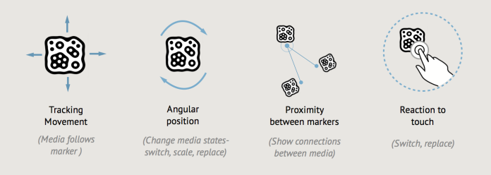
We could develop a language for the use of these markers, some of which are seen in the video. With movement, angular displacement, proximity and possibly touch, we could use the markers as switches, knobs, dials for manipulating media. As shown below:
Artboard 1 1
One could also imagine that these markers could be printed with ink visible only in the IR spectrum, easily picked up by cameras and invisible to the naked eye.(Quick update: Disney Research have used this system in their experiment linked below)
We could also think of controls like these distributed around a space, not just to control media (video, audio) but for other purposes. Like an universal physical interface, for example controlling all the electronic objects in your kitchen. A centralised hub with cameras for eyes, with/without need for projection.

There were of course difficulties with the setup.
1. Mapping the field of view of a camera with projected area is quite cumbersome and needed quite a bit of thought.
Artboard 1
My final solution was an empirical one where I had to continually displace the positions between them to find an optimal solution. As seen in the video it is still not exact. I presume that with more work this could be resolved for a particular space.
2. There are issues with hardware. Camera fidelity and resolution coupled with frame-rates is a big factor in the set-up, and need to be carefully considered. So is the projector’s resolution, but this was a lesser issue when compared to the camera.

There have been many other explorations in the same vein and I wish to highlight 2 of the most impressive, in my humble opinion:
1. Disney Research ‘Hideout’
2. Kollision’s ‘Advanced 3D projection’

This was a short 3 day exploration at SI-labs. Thanks to Ben for giving me the time and space to experiment 🙂 I hope to use the kinect in conjunction with the projector in the next stages, as I think it throws up more possibilities. Stay tuned for more!

Standard
Thoughts

It’s been an year of change and interesting new grounds

It’s been a while since I posted anything here, so I thought a quick update is on the cards.
I moved to Berlin last September and have been working at Service Innovation labs here. SI Labs is a start-up focused on consulting with Urban mobility projects for major automotive clients in Germany.
We are a small young team of 5 but we are now growing quickly, having moved to a new office and expecting more talent to join us soon. The future of this start-up looks quite promising with challenging projects so far. I will be here for a year and so do drop by if you are in the city.
Berlin pic

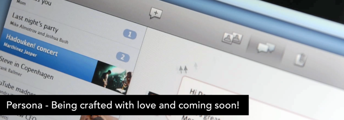
In the meanwhile I have also been working on my pet project Persona along with Seckin and Marco. Loads of learning in collaboration with our development and marketing teams. We are getting to a finish slowly but surely. More updates on that soon!
Persona

PS. I have a tumblr account now, displaying some quick experiments into the Physical and Digital. It is at ‘…& other tales of wonder” .

Standard
Design playground, thinking interfaces

Thinking about the near future of interacting with audiobooks

Screen Shot 2013-06-23 at 10.51.12 PM copy

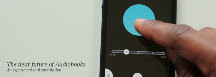
This is an experimental sketch and speculation as to the near future of audiobooks or to look even broader, text converted speech. I look to explore more interactive methods of consuming or listening to audiobooks with an eye on recent technological developments and a few pointers from informal user research. This is work in progress!

Audio books have been among us for a while now. From the earliest ideas of Edison, where he envisioned a phonograph playing recordings of books in every household to the app based consumption models of today, the basic concept of listening to an audiobook via a device has remained relatively unchanged. 
But with the advent of screen and touch based interfaces, an ever increasing sophistication in text to speech conversion (and vice versa)  and asynchronous communication between text and audio,  we can possibly explore alternate modes of interacting with audiobooks, expanding the scenarios of use and making them as rich as an actual book.

The_Papa_of_the_Phonograph,_Daily_Graphic (1)

Why do Audiobooks need enhancement?

These set of thoughts are based on my experiences with audiobooks over the years and conversations with a few people I know and also interviews with authors** who love the medium and understand it’s many limitations.
For instance, audiobooks are brilliant for listening to narrative texts, where a voice can hold you in rapt attention to a scene in a book and can actually lend to imagination, largely based on the quality of the narrator.

“An audiobook is its own thing, a unique medium that goes in through the ear, sometimes leaving you sitting in the driveway to find out how the story is going to end.” – Neil Gaiman

But there are limitations, when compared to reading…

– a loss in the sense of time and space, in terms of handling the medium. For instance  dog ears in a book, page numbers, bookmarks, specific constructions of paragraphs all act as indicators in traditional media like paper. Or even in ebooks.

– this loss in the sense of space and time seems to play an important part in memory. The construction of sentences for instance aid in associative memory with respect to passages you love in a book.

– the earlier aspect of cognition and memory make it difficult for people to read reference books or text books. Also adding to the difficulty is the loss in understanding other media if present among the text. For instance, a picture, video , graphs cannot be translated and make it absolutely impossible to rely on an audiobook. Even though some people learn more by listening rather than reading. (A lecture vs a text book for example)

So through the following explorations, as I have tried to explain via a short video clip and text, look at other modes of interacting with audiobooks, possibly with apps in touch based devices.

The elements presented in the video:

1. An animated and interactive indicator for speech, which also enables you to mark passages you wish to return to. more images 1

2. Returning to the marked passage with your scrubber which provides you aural and visual feedback on interaction. more images 2

3*. Easy switching between audio and text, which are synchronously connected. This could be especially useful while working with reference or text books, with other media present.more images 3

These were quick explorations, done over 2 days, which could possibly be extrapolated further.

*Since I wrote this post, the ever innovative Amazon have launched Whisper sync for voice, a fantastic feature which enables a user to jump between text in a book , to the corresponding space in an audiobook. Glad to see point no.3 has seen the light of day. ** The wonderful Neil Gaiman speaks about Audiobooks in this npr story.

Standard
thinking interfaces, Thoughts

Thinking about email ….

It’s been a few months since the video and thoughts around Persona (an email client I designed with Seckin and Marco at Ciid) were made online. We spoke about the need in bringing personality and people into the forefront of mail and the fact that it needed a radical rethink, both in the UI and philosophy, from legacies dating from the desktop metaphor and the chronological presentation of mails like in a spreadsheet.

Since then there have been some really interesting developments in this field of communication  (and our project too, which soon might be more than a concept ) that makes me feel the future of email is promising and is going to be ‘un’broken. Part of the optimism is in the fact that are some radical mail rethinks which seem to be on the verge of appearing in the market simultaneously.

Fluent

Fluent (being built by the guys who were part of the Google wave team), at first glance seems to be an incremental yet remarkably different approach to email, with all the familiar features to email co-existing with a visually pleasing UI ( though they seem to have a lot of work to do with respect to semantics in certain areas of the interface) They have an interesting demo, which can be played with here.

Mail-Pilot

A mail client as an assistant, with their chief pitch being emails as simple & pliable ‘TO-DO’ lists. This is an interesting approach by Josh Milas and Alex Obenauer , who got their project funded at KickStarter recently. Kudos to them !

Minbox

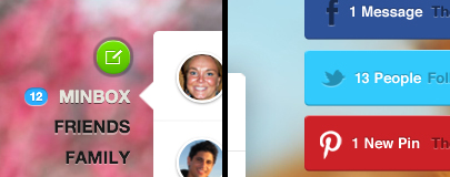
According to their pitch, the mail client focuses on people and sociality as the primary drivers and viewpoints for email. The team led by Alexander Mimran and Michael Lawlor , who previously created the ‘Penzu’ app , have not made any screenshots for the interface readily available as of now.

You can have a glance at their pitch at the ‘Launch’ conference this year, in this video here , as it showcases some of the innovative features they are coming up with and also provides a sneak peek into the interface, which looks quite radical for an email client.

Overview

So where is email headed? It seems that there is an overall push to get out of the spreadsheet mode. which is heartening. Visual interfaces too are undergoing a world of change, with a tasteful treatment of content, where it was authored and most importantly by whom.

From the incremental UI changes brought on by the ‘Sparrow‘ application we may see a powerful shift with Fluent and Minbox . This is because they seem to be using models of interaction which are becoming familiar through instant messaging in Facebook etc. Mail has been shortened to snippets of conversations in most accounts, when personal correspondence is considered.

‘Mail Pilot’ seems to focus on the meaning behind the content and the action that is supposed to be associated with it, a task based approach, which may work for both personal as well as business correspondance. This is very different from the radical ‘Minbox’, where the focus and groundwork is based on the ‘who’, the author and the meaning behind where the mail came from. Hence the focus falls on people and sociality, which changes the face of presentation and makes it truly radical (This seems to be closet to the thought behind ‘Persona’).

But this has the hidden danger of bifurcating the email client market into the power/business users, who might still need the raw functionality of Apple Mail or Outlook, and the generic non-power users for whom simplicity matters.

Only time will tell which of these applications will grind out in the competition (if there is one). There is also the issue of multiple platforms and devices that these clients have to operate under, which will be crucial for success. It might be a testament to the changing times and preferences and needs of people in the matter of interpersonal communication. This I think makes it truly interesting and worth looking out for.

Standard
thinking interfaces, Thoughts

Thinking about gestures …

I have been pondering over a project recently which required some understanding and perspective about gestural interfaces on touch screens. It led me to reading a few articles and forming some of my own thoughts, which I wish to share.

I find gestural interfaces (Ges.I) fascinating and also quite disconcerting. What I find fascinating is the way enables us to remove buttons/bars, which is any UI designers dream. A focus on minimalism, a focus on beautifully presenting content and playfully responsive interfaces is what follows on a well designed Ges.I.

Flipboard for example
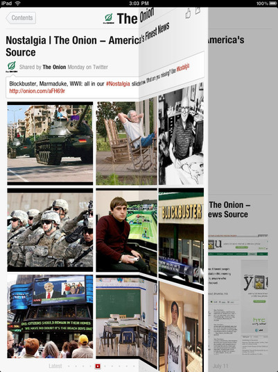
Whats disconcerting to me , is that though ges.I are supposed to be ‘natural’ interfaces theres a certain sense of randomness in action-reactions on screen across apps and platforms and lack of intuitiveness involved in discovery.

This has been reported and studied in this article ‘Gestural Interfaces: A Step Backwards In Usability‘ by the Norman Neilsen group. They very well define what I find uneasy about Ges.I by speaking about how the lack of guidelines in actions and their reactions across platforms has led to clashes with fundamental Interaction design principles (regardless of technology) like:

  • Visibility (also called perceived affordances or signifiers)
  • Feedback
  • Consistency (also known as standards)
  • Non-destructive operations (hence the importance of undo)
  • Discoverability: All operations can be discovered by systematic exploration of menus
  • Scalability. The operation should work on all screen sizes, small and large.
  • Reliability. Operations should work. Period. And events should not happen randomly.
Though I am not for Dogma in design, these are some very basic principles. They also mention the fact that, there are great potentials in using ges.I considering the emotional aspects of play and response in software , where using devices becomes a lot more fun (which is quite true in my opinion).
I have also been playing with quite a few apps on the iOS platforms using Ges.I off late and a couple of them which are interesting and I wanted to share are:
(thanks to Marco for pointing them out to me )
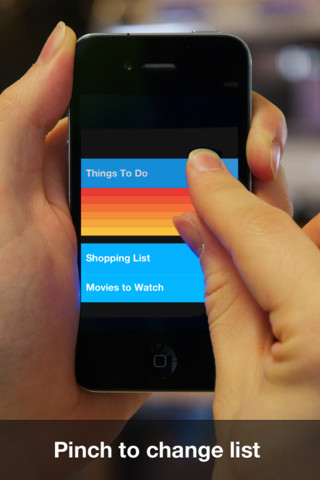
Clear which is a To-do list for the iphone
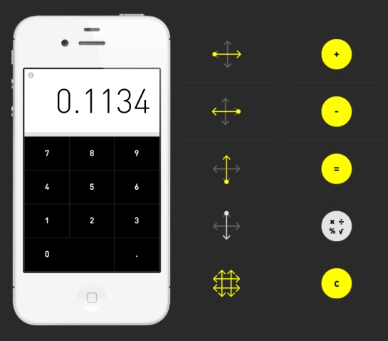
Rechner which is a calculator
I chose these as they are designed for extremely simple functions where scalability/reliability issues are minimal and are in the pursuit of a predominantly gestural model of interaction. I have also tried not to compare them much, because of their different uses.

Clear

When I first saw the video and finally got the app, I was excited. It is an attractive , minimal to-do list and totally hooked the Visceral part of my brain.
Its visual language with a heatmap displaying hierarchy and clear placemarks for tasks makes sense, and the content is thus the focus.
The program starts with a clear set of instructions on how to use the app and it is quite precise (it has to be considering that there are no ‘signifiers’ to an operation, and would leave me puzzled) though open to a certain amount of playful discovery as some of the interface is metaphorical.
For instance, the gesture to pull to create an item , or pinch 2 items apart to make a new one, is intuitive. This interaction is seamless, reactive and satisfying. The only problem with the pull gesture is that it activates the top menu bar in the ios interface , which is disconcerting (the clash with app and platform).  You would also expect that the opposite should be true too. That is the pull up gesture , which actually functions as ‘clearing’ a task.
Another interesting gesture is the ‘swipe to complete’ one, where the gesture in itself is quite natural.
An opposite swipe induces the now ubiquitous delete function. There is a problem here with retrieval of accidently deleted data (lack of undo). But its nice that there is a feedback system which exists during a swipe where an image of a tick or a cross appears during the course of an action. This gives the neccesary predictive indication about the operation you are about to perform.
But then starts the complexities which exist even with a simple app, with a gestural interface. Shown below are the 3 layers of information which are supposed to exist.
Now once you are at a bottom layer, you get to the upper layer with a pinch-in gesture and then another pinch to the topmost layer. The pinch is quite playful again with a ping of satisfaction sounding at every pinch. But then the reverse is not true as it is then used for opening up new items in between existing ones. You need to slide up a page to get to the bottom level (consistency)and look at the different sub-categories, which are otherwise hidden (but this is a bane with multimodal interfaces on handheld devices)
Despite its certain shortcomings vis-a-vis gestures and what do they mean, I feel that focus on content and its form makes this fun and interesting to use. Looking at the service perspective , I think the clear 6 page startup instruction set / and the video stood out in getting the gestural message across to people and is very necessary and CRUCIAL to explain the interface.
I was also curious as to what the creator was thinking about when he made this app and stumbled upon this article in fastcodesign.
“Inchauste believes that, in time, users will come to just expect the conventions of Clear-like interfaces, too. What looks like an affordance-less cipher now, Inchauste says, will simply be so obvious to future users as to be automatic. I’m inclined to agree with him, to a point.”
… me too but to a point.

Rechner

I have always loved calculators (I was a mechanical engineer with 3 of them) and have enjoyed playing with them. So I was really curious to see Rechner in operation and bought one as soon as it was released. Being a gestural interface just added to the curiosity as it is quite radical in its approach.
On starting up , you get a much needed page displaying the basic operation set and the gesture sets which could be used.  This was interesting as other than the first three as shown below (addition , subtraction and equals to), the other two gestures and the operation they represented did not make sense to me till I tried it out.
In fact I had to watch the video to make sense of the ‘clear’ operation (It might reflect on how I interpret symbology , but it was an issue for me), which needs a two finger swipe on the screen. hmm…. a two fingered swipe on a calculator. I honestly could not help being hyper critical about this app after that.
On using the interface I came to understand the thin line that exists between looking for visual simplicity by removing elements for gestures and usability/intuitiveness.
A regular calculator already contains a number of symbols denoting arithmetic operations. Now when gestures are used in place of symbology it becomes quite complex as it means a certain amount of learning is required. Its not natural for a swiperight to mean addition and let alone a swipeup for subtraction. This is also a departure from the metaphorical approach in the Clear app we saw earlier, which then required much shorter learning time.
Also consider the operations required to perform a task:
A typical math problem: If Jane has to buy 4 apples and 6 oranges each for 7 of her classmates, how many fruits does she have to buy?
So lets tap away , first on a regular calculator with buttons and then on Rechner, considering the fact that you know basic arithmetic and what the symbols mean.
On a regular calculator, we use 6 rapid taps on different buttons. On a gestural interface we need to include swiperight , swipedown to search for multiply and then tap, swipeup to perform the operation.
The above is to just show the complexity brought in due to multiple gestures , in a single set of sequential operations.
A simple tap replaced by 3 different movements , which then need to be learned, is an issue.
Arithmetic might be simple , but gestures , especially when a number of them in sequence are considered, are complex and need to be treated with care. This is something I learned from this interface.
Rechner for me is a critical app, which actually makes you think about gestures. Its conception needs to be lauded for raising some important questions.
I do believe that gestures on screens lead to interesting possibilities for interfaces, playful with an emotional quotient, but then they need to be treated well and with care to suit functionality too.
I cannot help but to think about and put up a pic of the Braun calculator designed by its chief designer Dieter Rams and Dietrich Lubs in 1976, with its color coded buttons , especially the one which is yellow so that the most used operation on the calculator stands out. Should we lose this in the search for super simple interfaces? … I don’t think so.
Standard
Design playground, Thoughts

‘Frugal Digital’

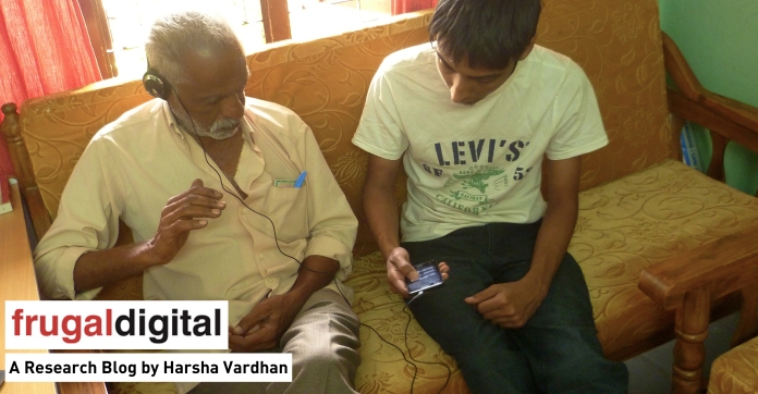
During the last month, I have been doing some work with the ‘Frugal Digital’ research team at the ‘Copenhagen Institute of Interaction Design’, Denmark. I was in India for a while conducting in-context research. You can have a look at the process blog for research done as part of the development of ecosystems around mobile technologies for the screening and management of hearing impairment among people in India.

Frugal Digital focuses on researching methods and practices around creating digital solutions in low resource settings like that of developing economies.

My primary contribution is with in-context research, analysis, identification of key issues and prototyping for solutions around them.

Standard
CIID, Design playground

Project update 5 …. Experiment in symbiosis 1 :

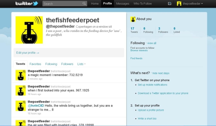
The experiment in testing a posible symbiotic relationship (above) and what it’s supposed to do (below)

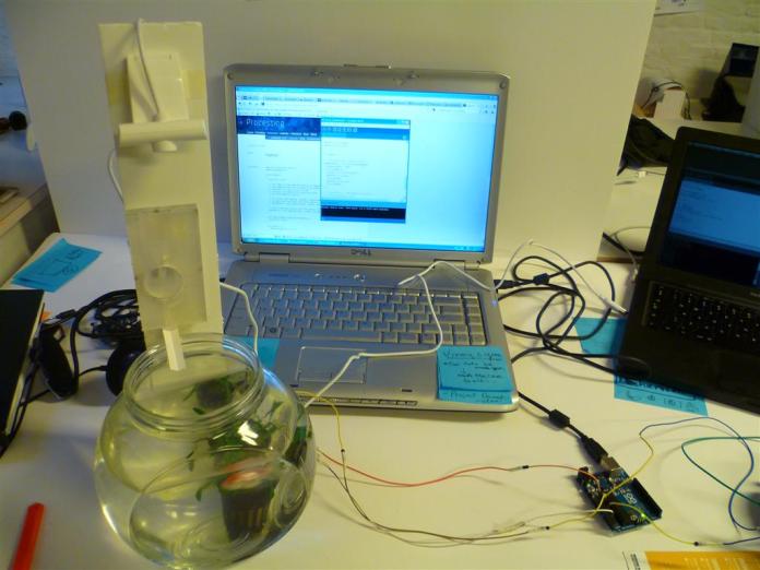
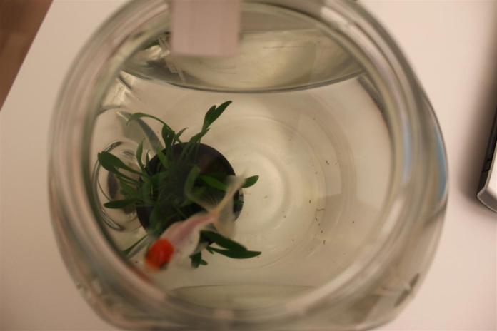
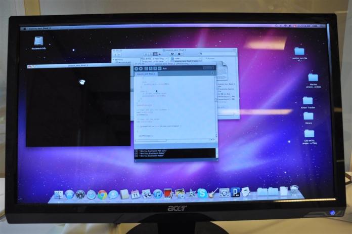
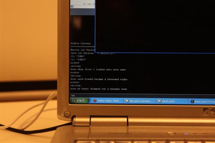
Thats the setup on my desk (below) at CIID , where I have the device talking to twitter (sending messages to the owners account and looking for his activity) via processing. which is then communicating to the arduino, controlling the feeder mechanism.  A webcam attached to the stem of the ‘Poet’ , functions as an eye and looks down at the fish in the bowl.


It took me a couple of days to craft the feeding mechanism(as seen below , above the bowl) and its a simple robust system now, which can perhaps store enough feed for a month.


Standard